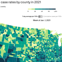
The year in COVID, visualized
This data visualization shows what the U.S. has been through in the past year of COVID: from the winter surge to the arrival of the vaccines — and now, sadly, back to the start of a new winter surge.
Between the lines: In a few seconds, you can see the welcome lull as many Americans got vaccinated and cases dropped off — and then their return with the Delta wave, and now the Omicron wave.

